Thought
Design
Why we still start with wireframes (even when tools make it tempting to skip)
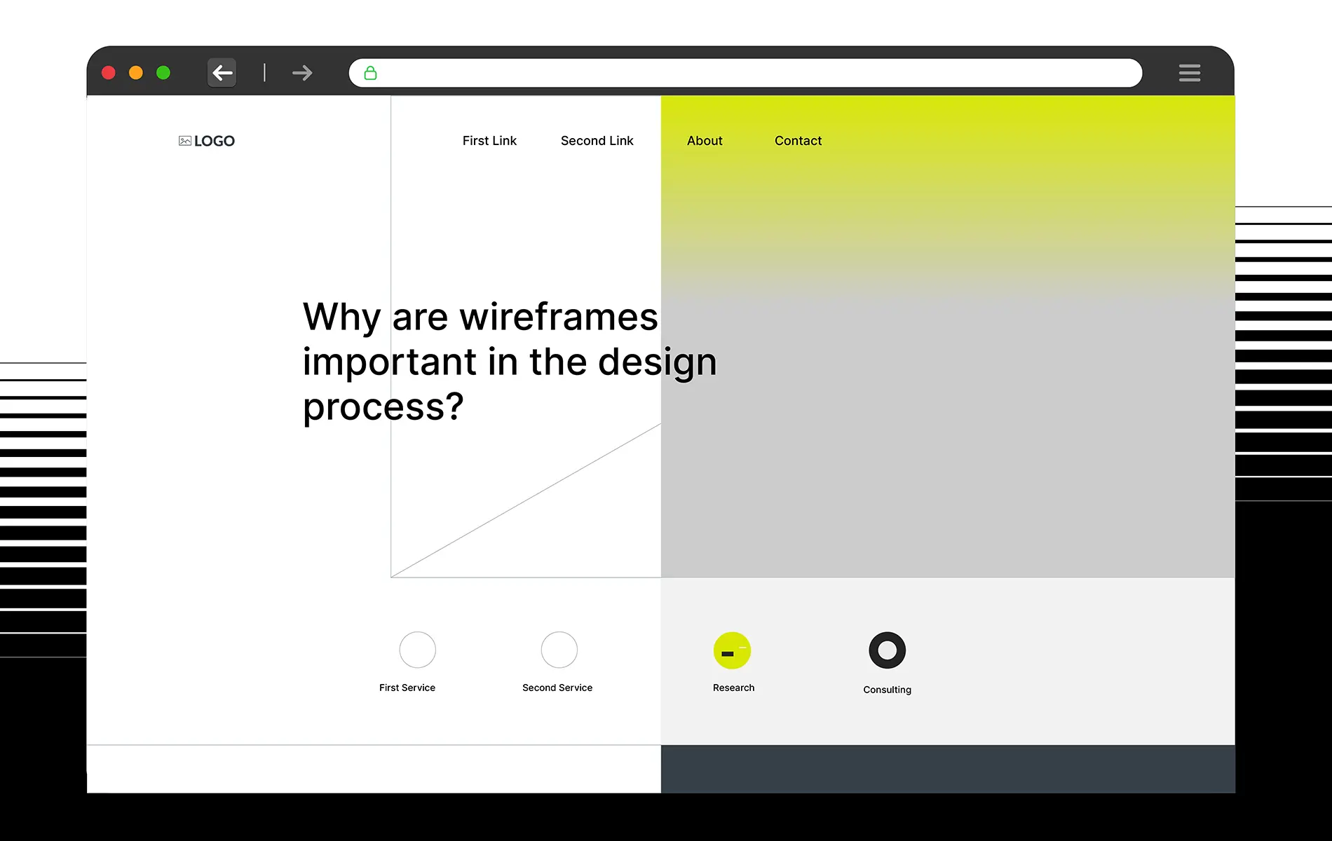
Wireframing still matters because fixing structural problems at low fidelity takes minutes, while fixing the same problems after visual design takes days. Wireframes catch IA and flow issues early, surface dev feasibility questions before commitment, and produce cleaner client feedback by removing color and branding from the conversation. Start low-fi, progress to high-fi when the question changes.
The temptation to skip (and why it usually backfires)
High-fidelity design tools make visual output fast. AI-assisted design tools can generate passable mockups from a prompt in minutes. For a lot of teams, the question has become: why bother with wireframes at all? Why not jump straight to Figma with brand colors, real images, and polished type, and let the high-fidelity version carry the conversation?
The cost of skipping usually doesn't show up in the moment you save. It shows up two weeks later, when the visual design is almost finished and someone notices that the navigation hierarchy is wrong, or that the form flow forces users through three unnecessary steps, or that a section the client agreed to on the mockup is technically infeasible given the existing backend. Now the fix costs days of revision across visual, copy, and handoff, instead of the 30 minutes it would have cost in a wireframe.
Wireframing is cheap insurance against expensive rework. Skipping it feels faster. It usually isn't.
Wireframe, mockup, prototype: quick definitions
Before going deeper, a clarification readers often want, because these three terms get conflated constantly:
Wireframe: A static, low-visual representation of structure and layout. No brand colors, no finished copy, often greyscale with placeholder text. The purpose is to show where things go and how they relate, not what they look like.
Mockup: A static visual design applied to the wireframe. Real type, real colors, real imagery, real copy. What the finished screen would look like if you printed it.
Prototype: An interactive simulation. Clickable, sometimes animated. Used to test flows and interactions with real users. Can be built from wireframes (low-fi prototype) or from mockups (high-fi prototype).
This article is about wireframes specifically. The decisions that belong in the wireframe stage are the ones you don't want to make for the first time in the mockup stage.
The three costs you avoid by wireframing
1. Rework costs: structural fixes are cheap at low fidelity
The later in the design process a problem gets caught, the more expensive the fix. A navigation hierarchy problem caught in a wireframe costs one conversation and a few minutes of redrawing. The same problem caught after visual design costs revising every mockup that touches that navigation, updating any prototype, redoing handoff specs, and communicating the change to everyone who has already seen the visual direction.
This isn't a theoretical cost. From our project work, the single biggest category of late-project slippage is structural problems discovered after visual commitment. Wireframing is how we surface those problems in the phase where they're cheap to fix.
2. Dev-Design handoff friction
Developers evaluating a finished mockup are often too late to flag the most useful feasibility concerns. The design team has committed to a visual direction. Asking "can we restructure this section" now sounds like pushback, not early collaboration.
Developers looking at a wireframe are in a different position. There's no visual commitment yet, so technical constraints can shape the structure rather than fight it. "This grid layout works on mobile but the back-end data model doesn't support filtering within the section the way you've drawn it" is a five-minute conversation at wireframe stage. It's a multi-day renegotiation at mockup stage.
Bringing developers into wireframe review, even briefly, is one of the highest-leverage process moves most teams don't make.
3. Client feedback that fixates on the wrong thing
Ask a client for feedback on a finished mockup and they respond to what's most visible: colors, type choices, imagery. Ask the same client for feedback on a wireframe and they respond to what the wireframe actually shows: structure, flow, content priority.
This matters because early-stage feedback shapes the direction. If the client spends the first review cycle reacting to color instead of hierarchy, structural issues go unaddressed, show up in the high-fidelity version, and then get caught late. Wireframes produce the feedback the project actually needs at each stage by removing the visual elements that aren't ready for discussion yet.
A secondary benefit: clients who see only high-fidelity work often feel like decisions are already made. Wireframes invite them into the structural conversation as a participant, not as a reviewer of a near-finished product.
What a useful wireframe actually shows (and what it doesn't)
A wireframe isn't just "a design without colors." It's a deliberate abstraction.
What belongs in it:
- Information architecture and page hierarchy: What lives on this screen, in what order, and with what relative importance.
- Layout and grid structure: How content blocks relate to each other, how they shift across breakpoints.
- Key interactive elements: Buttons, forms, links, navigation. Shown as recognizable shapes but not styled.
- Content priority: Headlines vs body text vs metadata, shown through size and placement even without final type.
- States that matter: Empty states, error states, loading states, where they change the structure.
- Implied interactions: Arrows or annotations noting "this opens a modal" or "this scrolls within the container" without building the actual animation.
What doesn't belong:
- Final copy: Placeholder or lorem ipsum is fine. Writing real copy in the wireframe stage mixes two decisions (structure and content) that are better made separately.
- Brand colors: Greyscale or a single accent color is enough. Adding brand invites reaction to the brand rather than to the structure.
- Finished imagery: A grey box labeled "hero image" is more useful than a stock photo, because it makes the discussion about layout rather than the specific picture.
- Final type: A consistent single typeface (or the defaults of whatever tool you're in) keeps the focus on hierarchy rather than typographic style.
- Micro-interactions and animation details: Note the intent. Don't build the execution.
The discipline of leaving those details out is what makes wireframing fast and the feedback focused.
Low-fi vs high-fi: the question determines the fidelity
Wireframes exist at different fidelity levels, and the common mistake is using the wrong one for the question at hand.
Low-fidelity wireframes:
Sketches on paper, rough digital drawings, or quick mockups in tools like Whimsical, FigJam, or Balsamiq. Fast to create, easy to throw away. The point is to explore lots of structural options cheaply.
Best for:
- Initial IA and flow exploration. "Where should this information live? How many screens does this journey take?"
- Early-stage client alignment on direction before the team invests time in details.
- Quick user testing where you want feedback on structure without distraction from visual polish.
High-fidelity wireframes:
Detailed digital wireframes in Figma, Sketch, or similar tools, sometimes with placeholder content that matches realistic length and grey boxes sized like real imagery. Still no brand styling, but closer to the final layout.
Best for:
- Validating that a finalized structure actually works at real content lengths and realistic proportions.
- Handoff-ready artifacts that developers can use to estimate effort, even before visual design is done.
- Late-stage structural reviews when the basic flow is settled but the detailed layout needs sign-off.
The common misuse: building a high-fidelity wireframe when the team hasn't yet agreed on the basic flow, so the detail is wasted. Or staying at low-fidelity too long when the team needs specificity to make detailed decisions. Match the fidelity to the question.
Progressive fidelity: the workflow that works
We run wireframing as a progression, not a single artifact:
- Sketch: Pen-and-paper or whiteboard, 10 to 20 minutes, exploring 3 to 5 structural options for a screen or flow. Throwaway by design.
- Low-fi digital: Whichever one or two sketches feel right, drawn cleanly in a digital tool, shared for internal review. Flow-level questions get answered here.
- Mid-fi: Tightening the low-fi with more realistic content length, proper grid, and structural detail. Shared with developers for feasibility review and clients for structural sign-off.
- High-fi wireframe (optional): When the layout is intricate enough that the mockup stage would be expensive if the layout is wrong, a detailed wireframe catches the remaining structural issues before visual work starts.
- Visual design / mockup: Only when the structure is stable enough that it won't change.
Each step exists to answer a different question. Skipping a step usually means the corresponding question gets asked later, at higher cost. The discipline isn't the number of steps. It's not levelling up in fidelity until the current level has answered the question it exists to answer.
When you can skip wireframes
Wireframing is a tool, not a ritual. Honest counterpoint: there are cases where skipping is the right call.
- Standard, well-known patterns: A login page, a 404 page, a basic contact form. The structure is established enough that wireframing adds ceremony without insight. Jump to the mockup.
- Late-stage revisions to working products: If the information architecture is already in production and feedback has validated it, a visual refresh doesn't need to revisit structure. Wireframing a component-level update is usually overkill.
- Teams with a mature design system: When the design system already encodes the structural decisions (layouts, components, spacing, hierarchy rules), much of what wireframing is meant to explore is already decided. The wireframe stage compresses dramatically because you're composing from known primitives.
- Rapid experimentation with short feedback loops: A/B test variants of an existing page where the underlying structure is already validated. Wireframing a small variation slows the cycle without adding value.
The judgment is: is there a structural decision this wireframe would help us make? If yes, wireframe. If the structural decision is already made or the pattern is standard, skip.
Who should be in the wireframing stage
Wireframing works best when it isn't just the design team. Bring in:
- Designers to drive the structural exploration and own the IA and flow decisions.
- Developers at least for review at mid-fidelity. Feasibility is cheaper to address before visual commitment. Front-end and back-end developers surface different issues, so include both when the project warrants it.
- Product or project owners to validate that the structure supports the business outcomes. Not every stakeholder needs to be in every review, but someone owning the business view should weigh in.
- Clients or key internal stakeholders at the low-fi and mid-fi stages. They give structural feedback more cleanly than when a visual version is present.
What doesn't usually belong in wireframe review: detailed visual-design feedback (the wireframe isn't ready for that conversation), brand governance critique (the wireframe isn't branded yet), or copy-level editing (the placeholder content isn't final). Keep the review focused on the decisions wireframes are meant to shape.
FAQ
What's the difference between a wireframe, a mockup, and a prototype?
Can I skip wireframes and go straight to high-fidelity design in Figma?
Should I use low-fidelity or high-fidelity wireframes for client presentations?
Who should be involved in the wireframing stage?
Writer
UI/UX Designer
Pavinee Kerdthong