Thought
Design
Beyond the happy path: the four UI states that define professional design
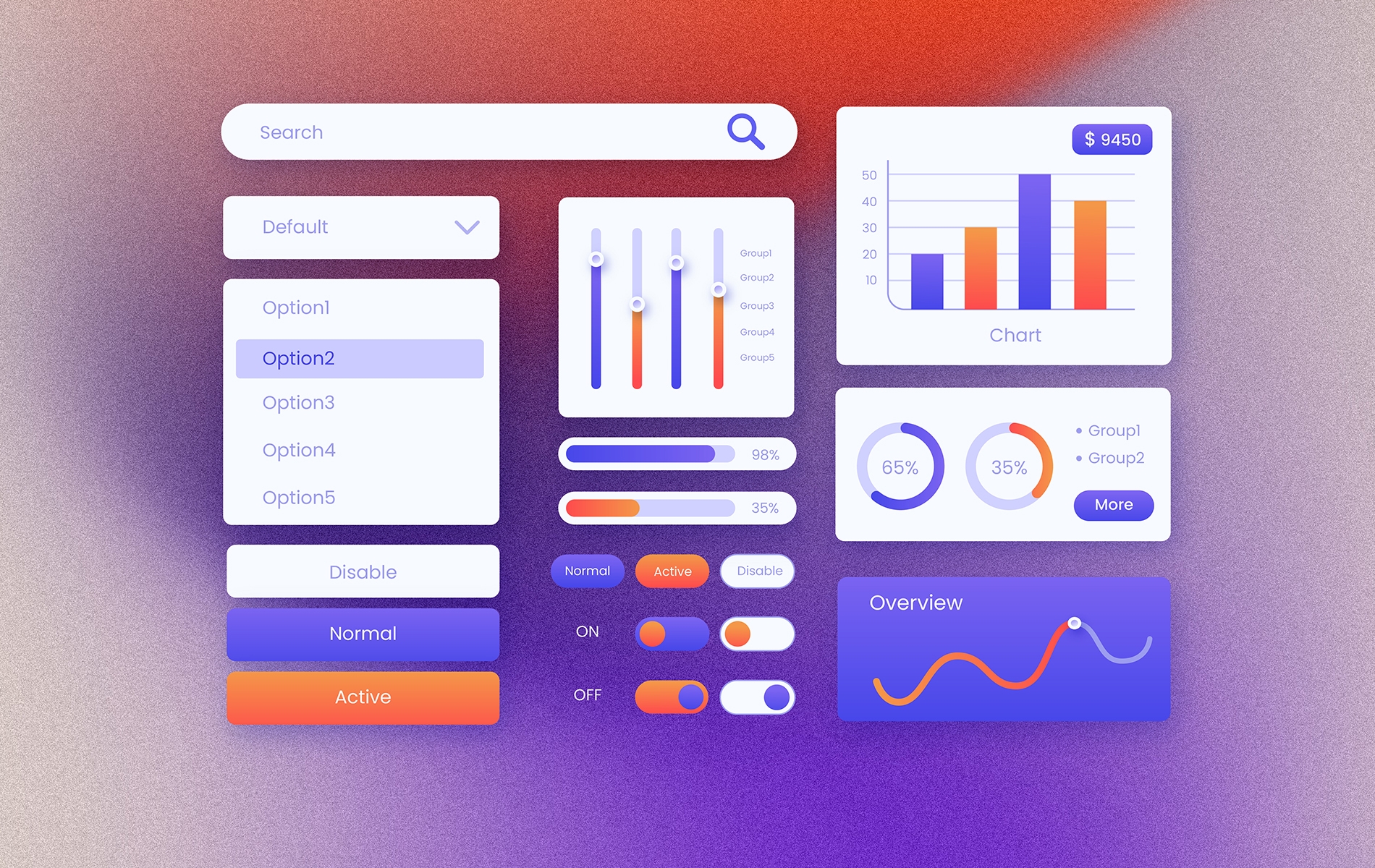
UI states come in four categories: Ideal states (response to user actions like hover and click), Process states (how data appears, loads, or is absent), Problem states (errors and successes), and Consistency states (same patterns across every screen). Professional design covers all four. Surface-level design covers only the first and third. Missing states produce specific, avoidable user frustration.
The happy-path problem
Most designs we see cover the happy path beautifully. The screen when data is present, the user does the expected thing, the system responds exactly as planned. That version of the product is usually well thought out, visually polished, and ready to ship.
The problem is that users rarely experience the happy path exclusively. They open a new account and see an empty dashboard. They hit an unstable connection and wait for something to load. They submit a form with a typo and get an error. They complete a purchase and need confirmation that it worked. The non-happy paths are where users actually experience the product most of the time.
The gap between competent and professional design isn't in how the happy path looks. It's in how the design handles the non-happy paths. A first-time user who opens an empty dashboard with no instructions leaves. A form that errors without explanation gets abandoned. A success that isn't confirmed produces anxious users who click submit twice.
UI state design is the discipline of specifying what the interface does in every state, not just the happy one. This article covers the four state categories every design should cover, what fails when each is missing, and the patterns that solve them.
Category 1: Ideal State
What it is: How the interface responds to user actions moment-to-moment: hover effects, click feedback, focus rings, micro-interactions, transitions between views.
The pattern to cover: Every interactive element signals that it's interactive. Users get immediate feedback when they act. Transitions between states feel smooth rather than jarring.
Concrete examples:
- A button that changes color or gets a subtle shadow on hover tells the user "this is clickable."
- A form field that highlights on focus tells the user "I'm ready for input."
- A brief animation when the user clicks "submit" tells the user "your action registered."
- A page transition that fades rather than cuts reduces the sense that the system "jumped" somewhere.
These are micro-interactions, small individually, but cumulatively they shape whether users trust the interface. A button that doesn't visibly respond to hover or click feels broken even if the underlying action succeeds.
Failure mode if missing. Users second-guess their actions. They click twice to be sure. They reload the page because nothing seemed to happen. They lose trust in the system's responsiveness.
Category 2: Process State
What it is: How the interface shows what's happening with data: when it's present, when it's loading, when it's absent, when it's partial.
Empty State
The pattern to cover: When there's no data to show (first-time user, no results, no history), the screen shouldn't be blank. It should tell the user what this section will eventually contain and what they can do to fill it.
Example: An e-commerce order history page for a user who hasn't ordered yet shouldn't show a blank space. It should say "No orders yet" and point the user toward the product catalog with a clear CTA ("Start shopping"). The empty state is an opportunity to onboard, not just a gap.
Failure mode if missing: First-time users see nothing and conclude the app is broken or useless. Empty states missed on common entry points (dashboard, feed, history) lead directly to abandonment.
Loading State
The pattern to cover: When data is loading, the interface shows that loading is happening rather than appearing frozen or blank.
Example: Skeleton screens, which show grey outlines of where content will appear, make pages feel faster than traditional spinners because users see the structure appearing and can anticipate where the content lands. For shorter loads, a subtle spinner or progress indicator works. The important thing is that some signal of progress is visible within the first 100ms of wait.
Failure mode if missing: Users think the app froze. They refresh or click again. Double-submitted forms, duplicated API calls, and frustrated users are common consequences of missing loading states.
Partial State
The pattern to cover: When the user is mid-way through a multi-step process, show where they are and where they're going.
Example: A sign-up flow with three steps displays a progress bar ("Step 2 of 3") so the user knows they're past the halfway point. A long form displays which sections are done and which remain. A process with background jobs (a file upload, a data import) shows progress percentage or estimated time.
Failure mode if missing: Users abandon multi-step processes because they can't tell how much further they have to go. Drop-off on long forms increases significantly when progress isn't visible.
Category 3: Problem State
What it is: How the interface communicates when something went wrong or right.
Error State
The pattern to cover: When something fails (invalid input, network error, missing permission), the user gets a clear, specific message about what went wrong and what to do about it.
Example: Inline validation on forms shows the error directly under the field that has the problem, in real time, as the user types or exits the field. The message is specific ("Please enter a valid email address") rather than generic ("Form validation failed"). The user can fix the issue immediately rather than submitting, being rejected, and hunting for what went wrong.
Failure mode if missing: Users hit errors they can't interpret or can't find. Forms get abandoned. Support tickets increase because the user couldn't self-serve their way out of an error state.
Success State
The pattern to cover: When something succeeds, the user gets clear confirmation. Not just "form submitted" but enough detail to feel confident that the action took effect.
Example: Toast notifications that appear briefly at the corner of the screen after an action succeeds ("Changes saved"). Confirmation pages after purchases that summarize what was ordered, when it ships, and where the receipt was sent. Green checkmarks next to items in a list that have been completed.
Failure mode if missing: Users don't trust that their action registered. They resubmit, creating duplicate records. They call support to verify. They abandon the task because they can't tell if it's done.
Category 4: Consistency State
What it is: The same patterns (colors, typography, spacing, interaction behavior) across every screen, so users don't have to relearn the interface on different pages.
The pattern to cover: A primary button looks the same on every screen. A success message uses the same toast notification style throughout. Form fields have consistent error styling. Spacing follows the same grid.
Why it matters: Users rapidly build mental models of how an interface works based on the first few screens they see. When later screens contradict those models, users have to stop and relearn. That cognitive tax shows up as slower task completion and lower satisfaction.
How this is maintained: Usually through a design system with documented components and tokens. We've covered the structure of design systems in detail in a separate article. For the purposes of UI state design, the short version is: consistency requires infrastructure. Without a design system, consistency erodes as the product grows, because each new screen makes slightly different decisions.
Failure mode if missing: The product feels uneven. Users can't form a reliable mental model of how it works. Small inconsistencies (button colors varying by page, form errors styled differently) accumulate into "this product feels amateurish" even when each individual page is well-designed.
The hidden cost of skipping states
Each missing state has a measurable cost. Not abstract user experience theory, specific abandonment and friction patterns we've seen across client projects:
- Missing empty state on first-visit screens. First-time users see a blank page and conclude the product isn't useful. Drop-off at first login is meaningfully higher than it needs to be.
- Missing loading state on any action slower than 300ms. Users click multiple times thinking nothing happened. Duplicate actions, duplicate API calls, sometimes duplicate orders.
- Missing error state on forms. Users submit, get rejected, and can't figure out why. Form abandonment climbs. Support tickets rise.
- Missing success state after important actions. Users don't trust the system. They resubmit (creating duplicates) or call support to confirm. Anxiety, not satisfaction.
- Missing consistency across screens. Users spend cognitive effort figuring out how each screen works. Task completion slows. The product feels harder to use than it is.
None of these are dramatic individually. Collectively they shape whether the product feels professional and whether users keep using it. Investment in covering all four categories consistently has one of the best ROI-to-effort ratios in digital product design.
The coverage check
Before shipping any screen, run these questions:
1. Ideal: Does every interactive element respond visibly when the user interacts with it? Hover, focus, click, drag.
2. Empty: What does this show when there's no data? Is there copy and a CTA that helps the user?
3. Loading: What does this show while data is loading? Is there a visible signal within 100ms?
4. Partial: If this is part of a flow, can the user see where they are and how far they have to go?
5. Error: What does this show if something fails? Is the message specific and actionable?
6. Success: What does this show when an action succeeds? Can the user tell it worked?
7. Consistency: Does this screen use the same patterns as every other screen in the product?
Running this checklist before shipping catches most of the common state-coverage gaps. Not every state applies to every screen, but being deliberate about which don't apply is different from forgetting to consider them.
Simple products still need this
Teams sometimes assume UI state design is for complex enterprise apps only. It isn't. A two-page landing form has all four states: ideal focus states on inputs, loading while submitting, error when email is invalid, success when submitted. The scale of the product doesn't change the number of states the design needs to cover.
If anything, simple products have less room to compensate for missing states. A complex app has many screens, and users are forgiving of a few rough edges. A simple landing page has one main screen. If its success state is missing, the user has nothing else to fall back on. Coverage matters more, not less, when the product is small.
The core takeaway
Surface-level design handles what the product looks like when everything works. Professional design handles what the product does when anything happens, including the common non-happy paths. The difference between the two isn't how much effort each puts into polish. It's whether the design deliberately covers the four state categories or treats them as afterthoughts.
The payoff isn't subtle. Users feel the difference between a product that explains itself clearly in every state and one that leaves them guessing. Over time, that difference shows up in retention, conversion, and how users describe the product to others.
FAQ
What's the difference between a UI state and a screen?
Which UI states do teams most commonly forget?
How do empty states improve user experience?
Does UI state design matter for simple products, or only complex ones?
Writer
UI/UX Designer
Pavinee Kerdthong